

Streamlining Employee Performance Reviews
A foundational redesign of the employee review answering experience within Tellent's performance management platform, delivered as the first phase of a broader cross-product evolution initiative to reduce friction, improve clarity, and enable scalable growth.

TL;DR
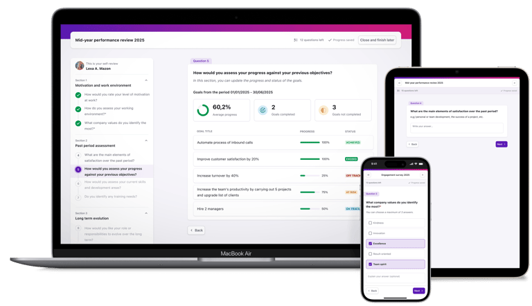
I owned the end-to-end design of the employee review answering experience as part of a phased redesign of Tellent Grow's performance review feature. Working within technical and timeline constraints, I modernized the UI, improved mobile responsiveness, and aligned the experience with Tellent's Design System. This enabled the company to deliver immediate value to 250 clients while more complex HR-facing workflows were being developed, reducing UX debt and establishing scalable UI patterns for future evolution.
Role: Product Designer
Timeline: Q4/2024 - Q3/2025
Team: PM, Software Developers, QA, Delivery Manager, Head of Design, Head of Product
Impact: €80,000 ARR supported across 250 clients
Goals:
Improve readability, navigation, and visual hierarchy across the review flow
Align the interface with Tellent's Design System for cross-product consistency
Enhance mobile responsiveness and incorporate accessibility improvements
Establish reusable UI components to support future workflow evolution
Deliver value to clients without requiring backend changes or workflow modifications
Problem Framing
Context
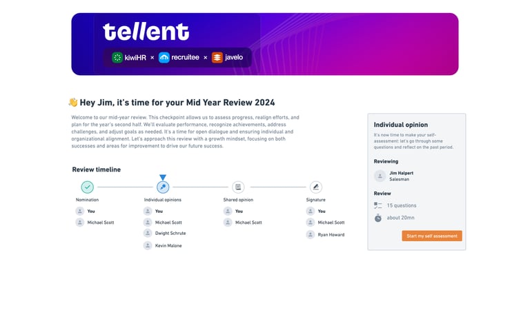
Performance reviews are a core feature of Tellent Grow (formerly Javelo), supporting a critical and often stressful moment for both employees and HR teams. As part of Tellent's platform consolidation, Grow inherited legacy systems that hadn't kept pace with modern usability standards. Customer feedback documented through an internal "50 UX Problems" initiative revealed that 60-65% of reported issues were tied to the performance review experience, making it both a business priority and a prerequisite for deeper workflow improvements planned for the HR side of the product.
Problem & Objectives
The employee review answering experience suffered from inconsistent styling, poor mobile support, unclear error messaging, and weak visual hierarchy, creating friction during an already high-stakes process. For the business, this represented technical debt, cross-product inconsistency, and a barrier to evolving more complex HR workflows.
Timeline pressure and the need to work within existing data structures led to a strategic two-phase approach: first, redesign the employee-facing experience (~30% of total scope), which could be delivered quickly without backend changes; second, tackle the HR-facing workflows requiring deeper technical discovery. This allowed us to deliver early value, reduce immediate UX friction, and establish a scalable foundation while the larger redesign progressed in parallel.
My Role
I owned the employee review answering experience from discovery through delivery, covering problem auditing, flow mapping, low-fidelity explorations, high-fidelity UI, and final handoff to development. I contributed to scope definition during a co-creation workshop with design and product leadership and worked closely with the Head of Design, PM, engineers, and the Design System team to ensure feasibility, reduce risk, and maintain consistency with Tellent’s evolving brand. Throughout the project, I validated decisions through regular syncs, async feedback loops, and hands-on collaboration with developers to refine edge cases and support implementation during Storybook-based QA.
Design process
Discovery & Framing
The project began with a comprehensive UX audit I conducted as part of my onboarding at Tellent, which complemented the ongoing "50 UX Problems" initiative. This audit, combined with analytics from Mixpanel, qualitative feedback from customer interviews (via the PM and Customer Success), and desk research, surfaced the core issues affecting the review experience.
During the two-day workshop, each participant presented their research: benchmarking, analytics, proto-personas (which I created based on internal interviews and desk research), and user pain points. We co-created a user journey map of the employee review flow, identifying the most critical problems and opportunities. At the end of the workshop, we divided the work into three major phases (introduction, review answers, summary) and created initial wireframes in pairs, then voted on the strongest ideas and assessed them through the lens of feasibility, prioritizing essentials and identifying future improvements.
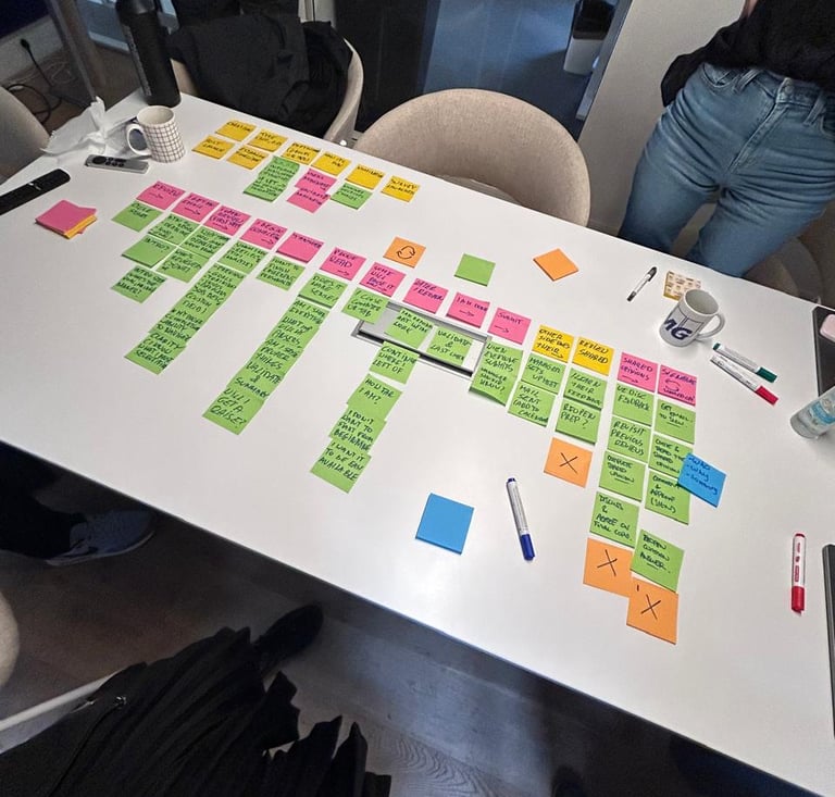
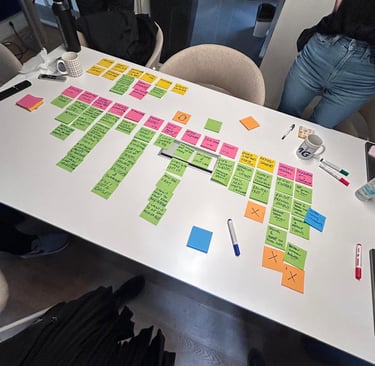

Wireframes generate during the workshop
Exploration & Validation
Using the workshop wireframes as a foundation, I mapped user flows for core tasks to identify friction and points of confusion. Low-fidelity explorations tested ways to clarify hierarchy, spacing, and question structure, with rapid iteration supported by weekly design critiques and asynchronous Loom walkthroughs with PM and engineering. This continuous feedback loop replaced formal usability testing, which wasn’t feasible due to time constraints and the fixed HR review cycle.
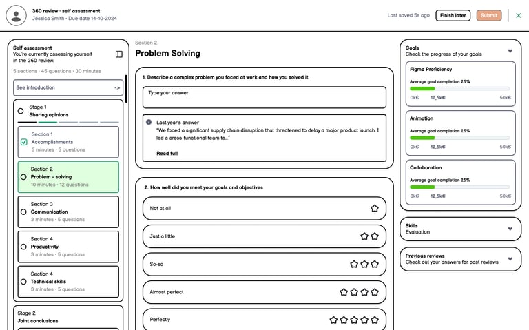
A key challenge was balancing modernization with familiarity for long-time Javelo users. I focused on improving spacing, typography, and Design System–aligned components without changing the underlying workflow. As the designs matured, I worked closely with the Design System team to adapt components for text-heavy, multi-level form contexts, establishing a strong foundation for future iterations of the performance review experience.
UI explorations
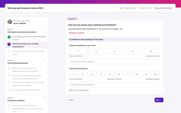
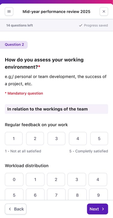
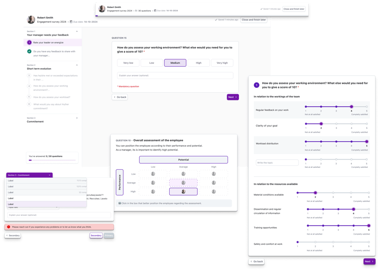
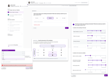
Old UI: Sliders caused low precision, poor mobile usability, and accessibility issues
New UI: Improves clarity, spacing, and touch-friendly selection
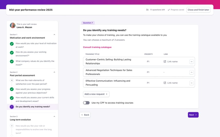
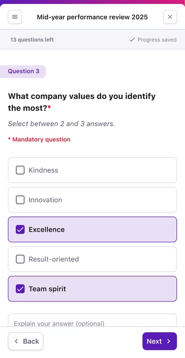
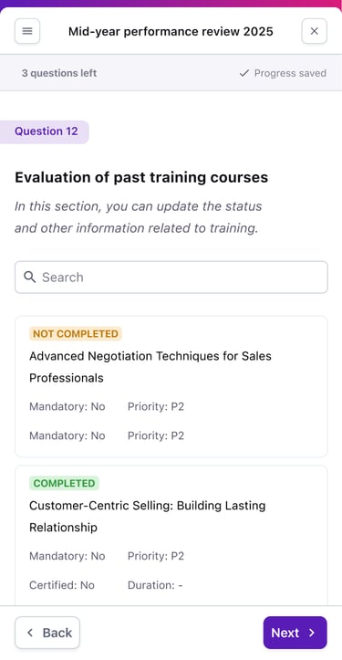
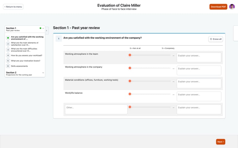
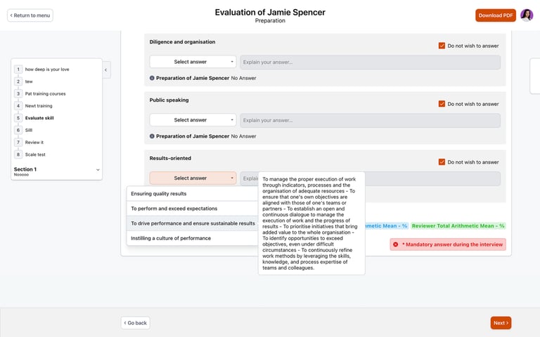
Old UI: Dropdown with hover tooltips caused visual clutter and poor mobile usability
New UI: Inline options with clear descriptions improve readability and navigation
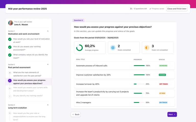
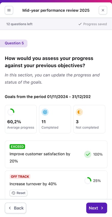
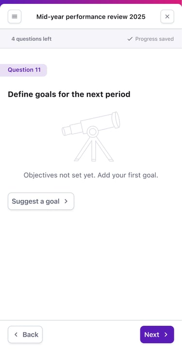
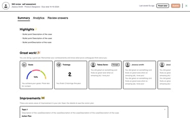
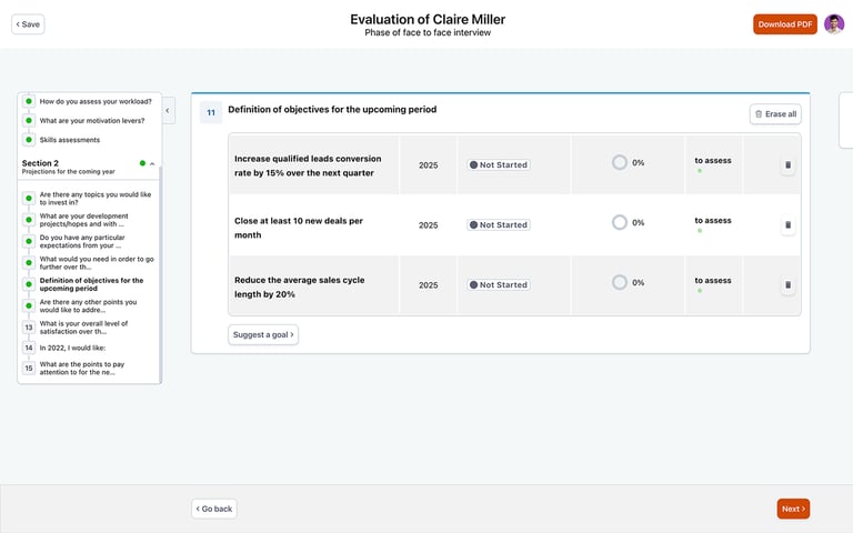
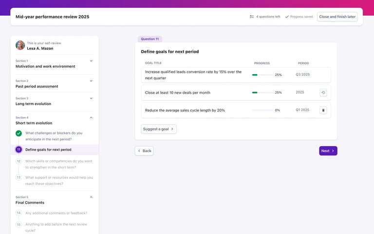
Old UI: Outdated visuals, noisy data, and no editing capabilities
New UI: Clean DS-aligned UI with granular data and edit mode
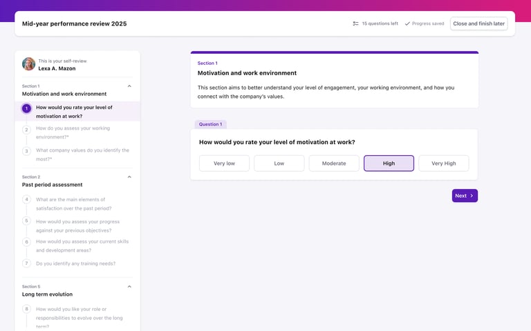
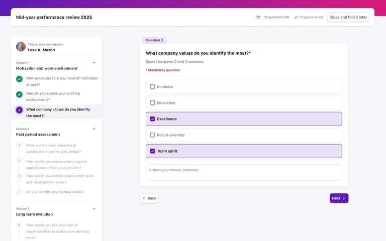
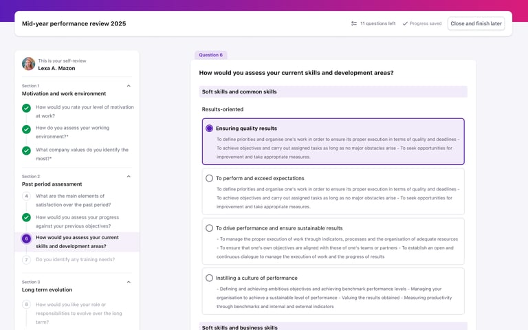
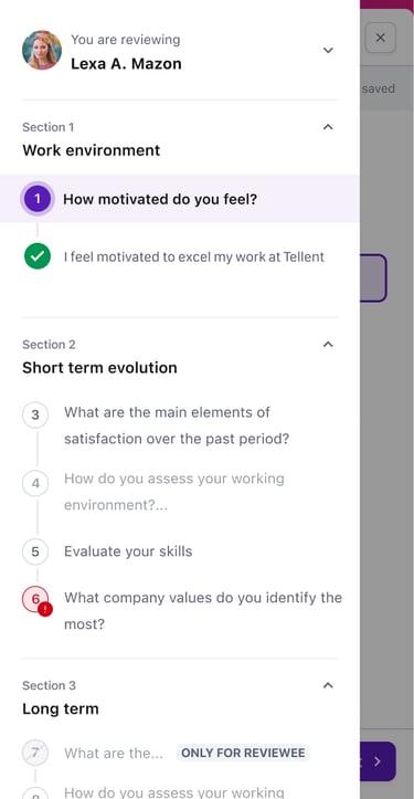
UX improvements in practice
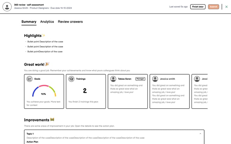
Final Design Highlights
Modern, accessible UI aligned with Tellent's Design System, incorporating ARIA labels and keyboard navigation
Improved mobile-responsive experience addressing critical gaps in the legacy interface
Clearer visual hierarchy for multi-level content, enabling easier navigation through complex review structures
Adapted Design System components for data-heavy form contexts, establishing reusable patterns
Scalable UI foundation supporting future product evolution
Optional toggle allowing gradual client adoption (available through Q4 2025)

Impact
The redesigned employee review experience was made available to 250 clients, supporting €80,000 in ARR. The phased rollout strategy – first internal deployment during the mid-year review cycle, then client launch with an optional toggle – allowed for real-world validation, iterative refinement, and gradual adoption without disrupting existing workflows. Internally, the work reduced UX debt, established scalable UI patterns, and enabled the development team to move forward with the more complex HR-facing workflows (released in Q4 2025).
While formal metrics on completion rates or time savings were not tracked, the solution addressed the majority of customer-reported issues tied to the review experience and set a foundation for future enhancements.
Let's collaborate!
Contact me
Based in Paris, I’m open to remote or hybrid permanent roles. I bring expertise from SaaS B2B and B2C companies across early-stage, growth, and mature environments, helping teams design impactful products.