

Streamlining B2B Data Automation with UX-Driven Design
A streamlined redesign of Stract’s automation builder to improve usability, elevate UI quality, and unlock a more scalable foundation for complex data workflows.

TL;DR
I led the first UX‑driven redesign of Stract’s data‑automation builder as a UX consultant. By conducting user research, reorganizing information architecture, and redesigning the UI around clarity and usability, I improved prototype task success (average ~80-90%, with the hardest task rising from 0% → 60%) and drastically reduced cognitive load, enabling operations teams to build complex data workflows faster and with fewer mistakes. This redesign laid the foundation for a scalable, user‑centered platform architecture, and gave stakeholders a validated blueprint for future enhancements.
Role: UX Consultant (UX Audit, Workflow Redesign, UI Improvements)
Timeline: Nov/2023-Mar/2024
Impact: Improved task completion clarity, reduced operational overhead, and delivered a more intuitive data-automation flow for B2B users
I had the opportunity to work with Laís on a highly challenging project for our company, and her contribution went far beyond expectations. I strongly recommend her for any project that demands experience, collaboration, and a critical product vision.
José Mathias (Founder)
"


Goals:
Reduce cognitive load and improve scannability across the automation builder
Introduce a modern, consistent UI aligned with Stract’s brand
Make building and editing automations faster, easier, and more intuitive
Ensure consistency across screens and create a scalable foundation for future features
Problem Framing
Context
Stract is a Brazilian startup that provides a Google Sheets add-on to help B2B companies centralize and automate their data workflows, generating structured reports and insights from multiple sources. Their clients are operations and analytics teams that need to set up complex automations efficiently while maintaining accuracy. At the time, Stract had only an engineering team and no dedicated designer - this redesign was the company’s first UX initiative, introducing a user-centered approach to a product that had grown organically without formal design processes.
Problem & Objectives
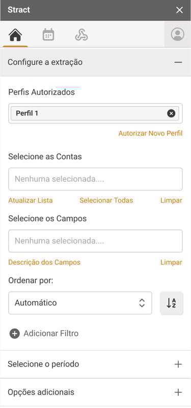
The automation builder had grown organically, accumulating features and interface patterns that made the product cluttered and difficult to navigate. Users struggled to understand each step, track dependencies, and validate automations before publishing. These challenges increased cognitive load, slowed workflows, and raised the likelihood of errors, especially for new or less technical users. Internal stakeholders and customer support frequently flagged these issues, and the lack of a cohesive structure limited the product’s ability to scale or support more advanced automation workflows. The redesign aimed to clarify the user journey, simplify interactions, and lay the foundation for a scalable, user-centered platform.
Design process
Discovery & Framing
I began by aligning with the founder on business goals, current challenges, and assumptions about the typical user. This early engagement ensured that research and design efforts were focused on high-impact areas.
I conducted desk research on competitor tools and workflows, and analyzed how operations teams interact with data automation tools in their daily routines. This helped uncover pain points beyond Stract’s current product and identify opportunities for efficiency gains.

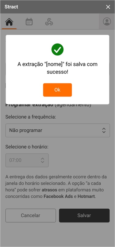
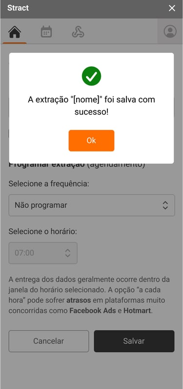
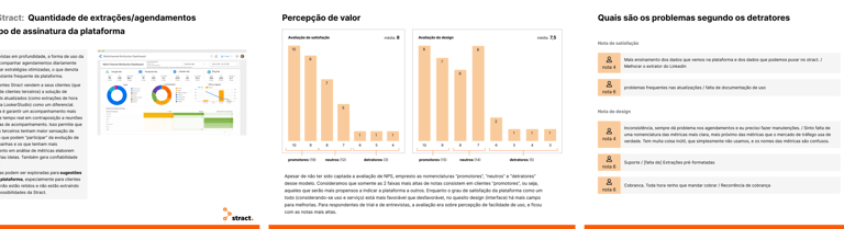
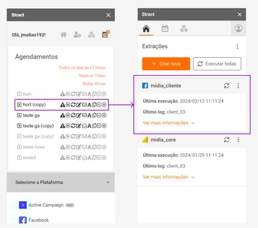
Pre-Consultancy UI Interface
User Research
To ground the redesign in real user needs, I conducted:
Surveys with the client base to capture quantitative insights on usage patterns, satisfaction, and support interactions.
1:1 interviews via video calls to gather qualitative insights, uncovering friction points in understanding steps, dependencies, and validation processes.
From this research, I synthesized key pain points, created user profiles, and presented findings to the founder. I also highlighted recurring language and terms used by users, which informed UX writing and feature labeling.
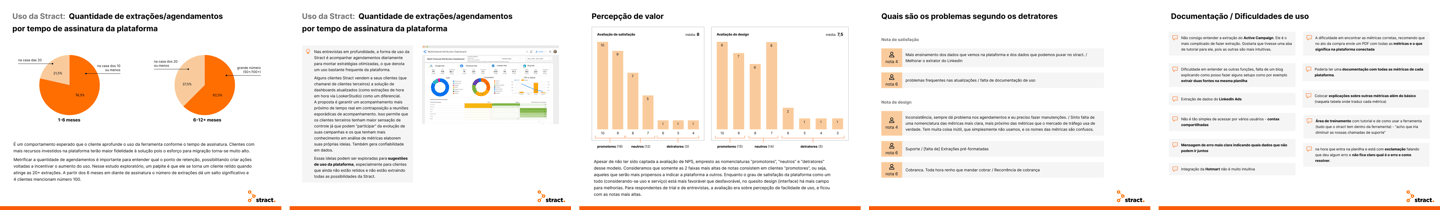
Slide deck summarizing user research insights to align the CEO on key pain points before the redesign
Prioritization
I combined research insights with stakeholder expectations and technical constraints to define a prioritization strategy, ensuring the redesign addressed the most critical issues first while remaining feasible within the engineering team’s capacity. This approach balanced short-term wins with long-term scalability.
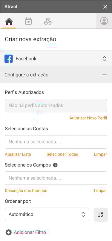
Ideation & Information Architecture
Using the research insights, I mapped the “to-be” user flows, focusing on clarity and simplicity. I reorganized the tool’s information architecture:
Grouped features logically to reduce cognitive load
Prioritized core tasks while moving less critical functions to secondary menus
Clarified error messages and surfaced crucial information upfront
This structure enabled faster onboarding and supported more complex automations in future iterations.
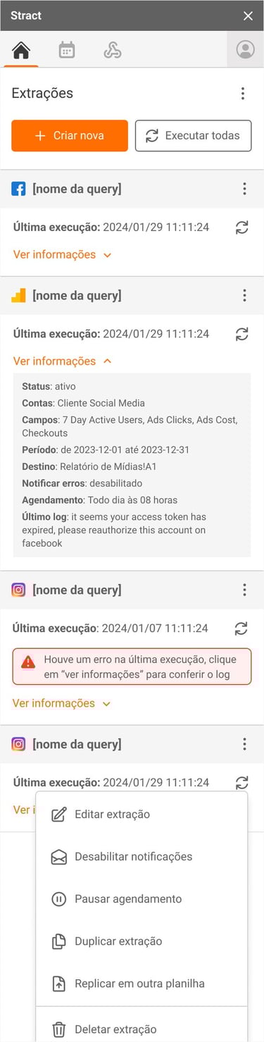
UI Design & High-Fidelity Screens
I designed a modern, cohesive interface emphasizing:
Clear hierarchy and spacing to improve scannability
Consistent typography, colors, and components aligned with Stract’s emerging brand
Enhanced feedback for empty, loading, and error states
Screens were designed modularly to support future expansions, maintaining a scalable design system.
Validation
I ran three rounds of unmoderated usability tests on Maze, covering 10 tasks ranging from simple to complex. The majority of tasks achieved 80–90% success, demonstrating that the redesign significantly improved comprehension and efficiency for typical workflows. The most complex task, while still challenging, improved from 0% → 60% success, providing additional insight into areas for future refinement. Observations from recordings, heatmaps, and user feedback informed iterative improvements in labeling, grouping, and interaction patterns, ensuring the final design met both usability and scalability goals.

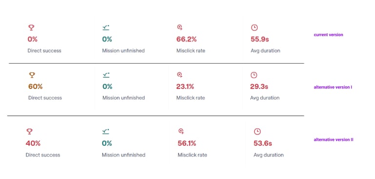
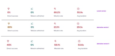
Usability test results for the most complex task: completion rate improved from 0% → 60%, showing significant usability gains despite remaining challenges.
Impact
The redesign of Stract’s automation builder reorganized workflows, applied consistent UI patterns, introduced modular reusable components, and included a UX writing guide based on client language. This led to a cleaner, more intuitive interface, reduced cognitive load, and faster task completion, creating a scalable foundation for future automation features, easier onboarding, and stronger alignment between design, engineering, and stakeholders.
Key outcomes:
Majority of tasks reached 80–90% completion; most complex task improved 0% → 60%
Baseline metrics established for task success, errors, and time-to-complete to monitor post-launch adoption
UX writing guide informed clearer labels and interactions for users
Modular, reusable components enabled future scalability
Comprehensive Figma handoff with embedded instructions supported smooth implementation and iteration

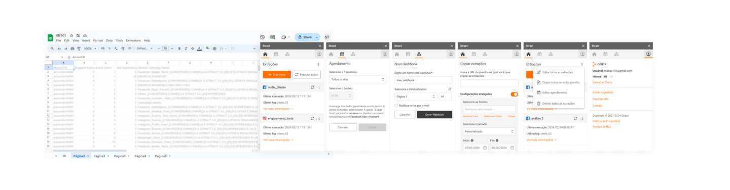
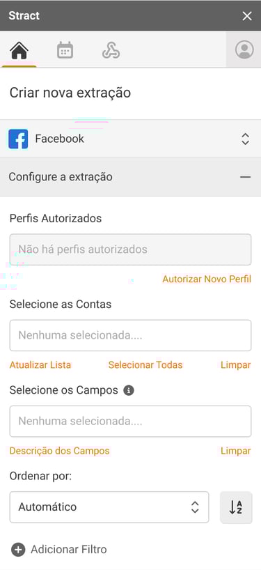
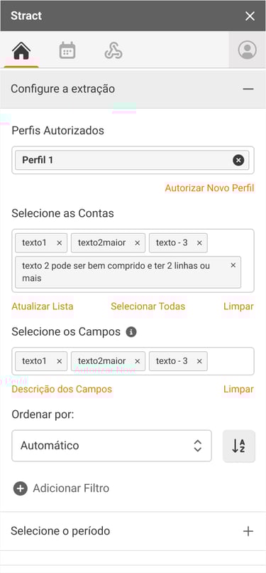
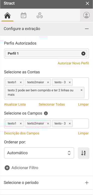
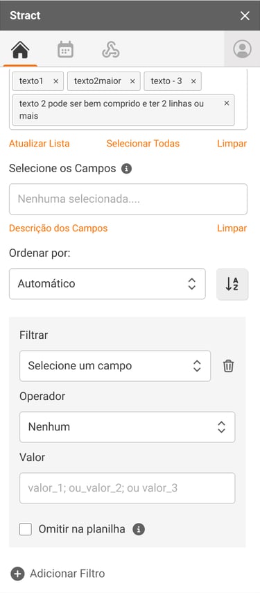
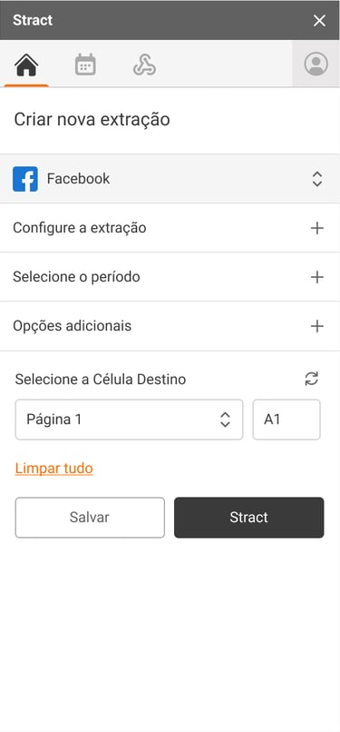
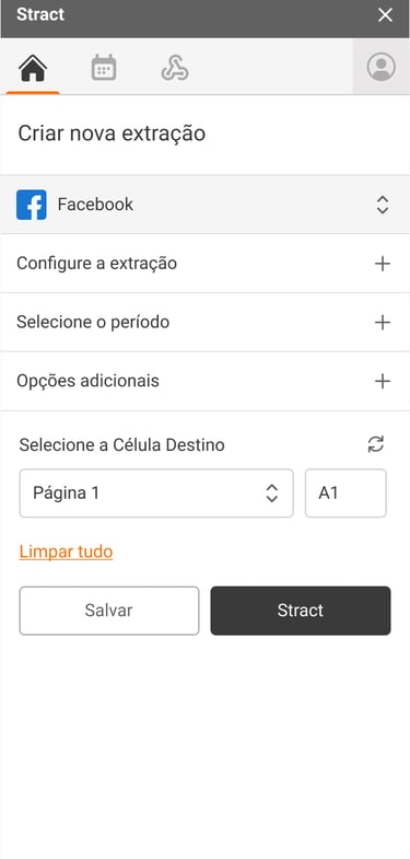
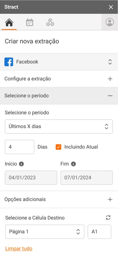
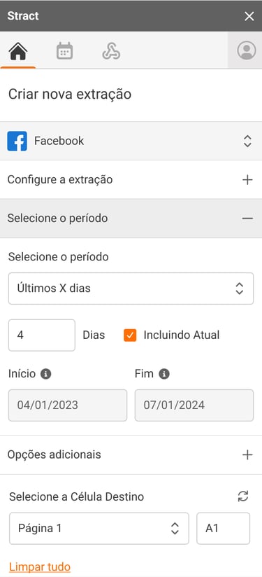
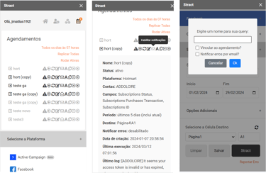
Before and after redesign of the UI/UX
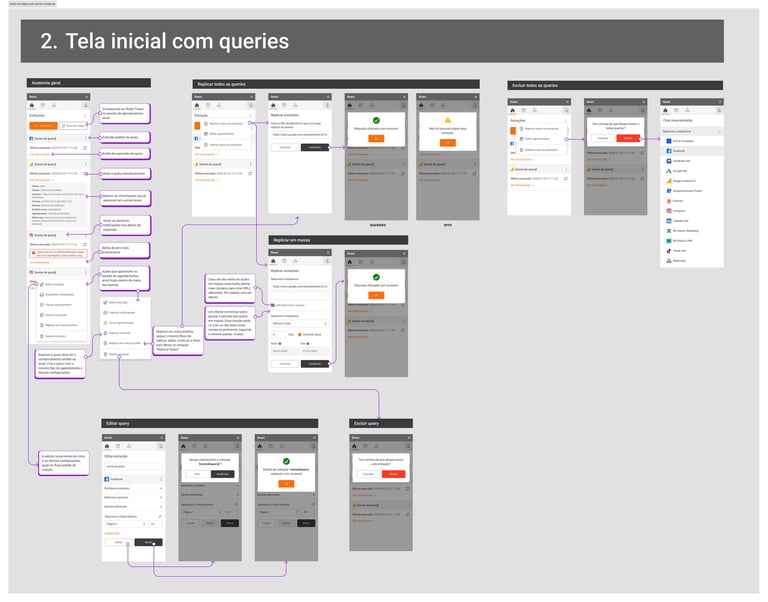
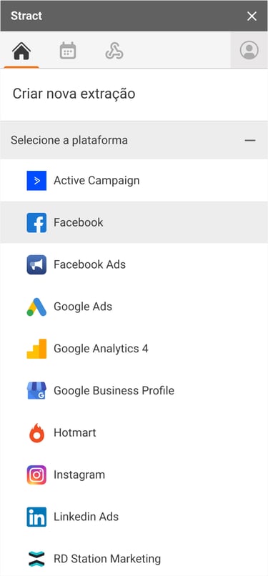
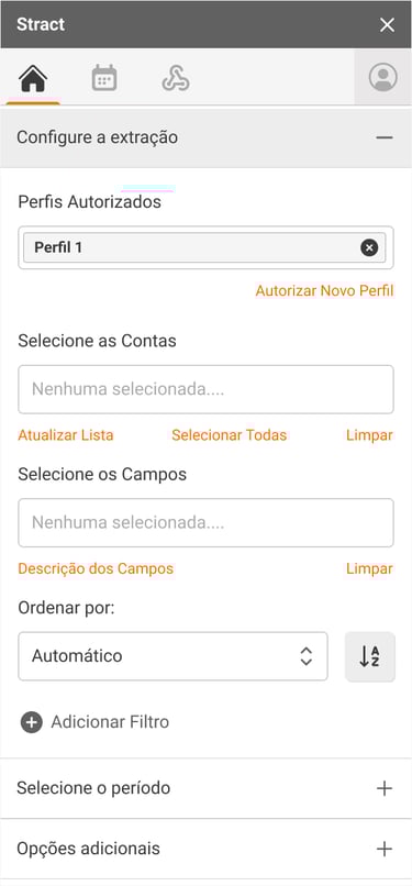
Example of a handoff of one of the flows for developers
Let's collaborate!
Contact me
Based in Paris, I’m open to remote or hybrid permanent roles. I bring expertise from SaaS B2B and B2C companies across early-stage, growth, and mature environments, helping teams design impactful products.