Innovative Transformation: Aligning Feito with Market Needs
In this case study, I delve into the comprehensive redesign and development process of Feito, a B2B management platform focused on productivity, OKRs, and task management. As a UX/UI Designer, I played a pivotal role in evolving Feito from its early stages to align with market needs. This project encompassed everything from strategic shifts informed by extensive research to hands-on design and development, ultimately aiming to create a user-centric platform that supports seamless workflow and goal visibility for businesses.
Feito is a management platform designed for the B2B market, emphasizing productivity, OKRs, and task management. It was an early-stage startup held by RD2, a venture capital firm, and the project involved evolving the product to achieve market fit. I worked as a UX/UI Designer in the Product Team in close collaboration with the Growth Team. Eventually, we brought on an intern, and this project provided me with my first opportunity to mentor a junior designer.
My Role: UX/UI Designer
Team Composition: Me, UX Designer Intern, Product Manager and 2 developers
Period: June 2020 to April 2021
Work context
01
Challenge
Extensive research performed by the Growth Team informed the decision to shift the product strategy to achieve market fit. The Product Team's challenge was to review the value proposition to align with the new market positioning. After a thorough analysis of the current solution, it was decided that the platform would be completely rebuilt to improve user experience and evolve technologies for scalability.
02
Discovery
The starting point was desk research to gain an understanding of the market, related content, and the competition. Without access to real clients at the time, I sought user feedback on competitors to identify pain points and satisfaction levels with existing solutions, uncovering their unmet needs. I then conducted a competitor analysis, focusing on features and usability, comparing other platforms with our product.
Concurrently, I mapped out all the screens and flows of our platform to create an accessible file for collaboration with the Product Manager. The PM provided insights into which problems to address first and our differentiators according to the new positioning.
Our goal was to create a platform that empowers people in their workflow by providing clear visibility of company and team goals, enabling asynchronous work without losing track of important information.
Screenshots of the pages from the current solution at the time
Visual inspiration for the evolution of various features
Protopersonas
The proposed business model and research inputs guided the development of three proto personas: the CEO/founding partner, the team leader, and the employee. These proto personas helped us understand platform usage and goals, informing the creation of user stories for feature planning:
As a founding partner, I want to share and update the company's OKRs to motivate employees towards achieving key results.
As a team leader,
I want to define the initiatives for my team within specific periods so they can break them down into tasks.
As an employee,
I want to understand what it is expected to be tackled to plan my activities accordingly.
03
Building an MVP
Planning
In this phase, I reviewed the information architecture to align with the user stories, shifting the priority from micro to macro activities. Our MVP focused on delivering a task management solution, the core feature correlated to daily use and user retention. User flows were defined in agreement with the PM and the development team, particularly regarding the back-end, which was prepared to support the solution in parallel with design ideation.
Iteration and Style Guide
While sketching wireframes, I encountered design debt due to the old platform being entirely coded. I recreated all components in Figma, allowing for more creative freedom. Despite the burdensome task, it helped standardize for scalability, and I created the project's style guide as the first step towards a design system. This was a progressive task completed alongside iterations. Designs were refined through discussions with developers to enhance usability and facilitate fast development. Concurrently, I defined other flows and screens based on decisions made during the MVP process.
Components recreated on Figma to reuse in designs
04
Validation
After the first delivery, our internal team started using the product daily to test it, and we as the Product Team collected feedback and insights to adjust any technical or usability issues identified in-house. Concurrently, the Growth Team worked to attract early adopters to validate the solution in the market. To obtain external perceptions and minimize bias, we decided to conduct a usability test followed by a quick survey. Although testing with the general public wasn't ideal, we prioritized ease of use, believing it could be assessed by various users, even those not our ideal clients.
The intern participated in this phase, and we worked together to develop the user interview script. I mentored her on best practices for conducting user interviews and usability testing, enabling her to perform these tasks independently. People with varying digital skills, including users of competing platforms, participated in the testing.
Check-in feature page used in the usability test
05
Results
Although all participants completed the tasks satisfactorily, we identified usability issues and noted that some UI elements caused confusion, especially among less tech-savvy users. This guided our decisions for improvements. Key changes included:
The calendar was not used as expected, causing confusion and adding little value to the user flow, so it was removed.
Initially, it was possible to create tasks directly in the "Accomplished Tasks" area. However, users preferred to manually check each task, giving them a greater sense of control and accomplishment, prompting updates to the layout and system.
We observed that the product's purpose was not clear to users, providing an insight to improve communication about the product.
06
Product Evolution
Version II
The Product Team planned the next extended version, revising the strategy based on MVP learnings and inputs from prospective contacts by the Growth Team. We discussed requirements and user experience to inform the new backlog of features needed to cover additional user stories.
The next phase focused on the "Focus of the Week" feature, linked to the Team Leader persona, requiring differentiated access for management. We improved the task feature by enabling follow-up tags based on user tagging behavior and launched this with version II. Designers and developers worked sequentially, following agile methodology, testing, and adapting the solution.
In this phase, we decided the product needed a user interface update to convey a friendlier approach. Changes included lighter colors, a new icon library, and revised typography to improve information hierarchy.
Version III
In this version, we aimed to support platform automation, including routine creation. We reassessed the flows to adapt them to product evolution. To enhance the team leader's experience, we included the Focus attribution feature for task distribution among team members. Additionally, we planned a complete personal dashboard for users and a management dashboard. We also developed the onboarding process for the official market launch.
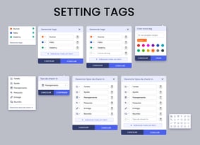
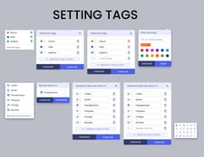
Focus of the Week page with updated UI and component set for setting tags
Onboarding flow
07
Future Steps
Before I left the team, the next planned evolotions included improving the OKRs page and workflows for creating, editing, tracking key results, and check-in integrations. Planned features included:
Automated OKR progress according to key result evolution (initially manual).
Key result creation based on type (increase / decrease / maintain / deliver).
Progress milestones with dates and expected results.
Key result status updates.
Tracking charts.
Activity logs.
Alignment with superior objectives.
Comments in check-ins and integrations with external files (similar to Trello).
All these evolutions were mapped out, with flows designed, awaiting implementation, testing, revision, and refinement.
Screens for all the features planned to be launched
08
Professional Growth
Reflecting on my journey at RD2 Ventures, I take pride in the substantial progress made in advancing the design maturity of the company and shaping Feito into a promising management platform. From spearheading a complete overhaul of the product to mentoring a junior designer, my experience underscored the significance of user-centric design and agile collaboration. While Feito was still in development, the foundation we built set the stage for future enhancements. This project was instrumental in my growth, helping me to advance in my career and expertise


